
Jazz music wall art is the practice of displaying artistic representations inspired by jazz culture, musicians, and musical motifs as framed or unframed pieces in residential and commercial spaces. The genre spans abstract jazz art, vintage jazz posters, canvas wraps, giclée prints, and layered wooden typography pieces. What sets this category apart from generic music wall decor is its deep cultural weight. Jazz carries the history of the Harlem Renaissance, the blues tradition, and Black American artistic identity. When you hang a piece of jazz art, you are placing that entire conversation on your wall.
What size and placement work best for jazz music wall art?
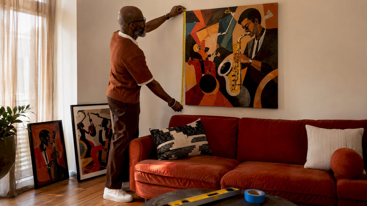
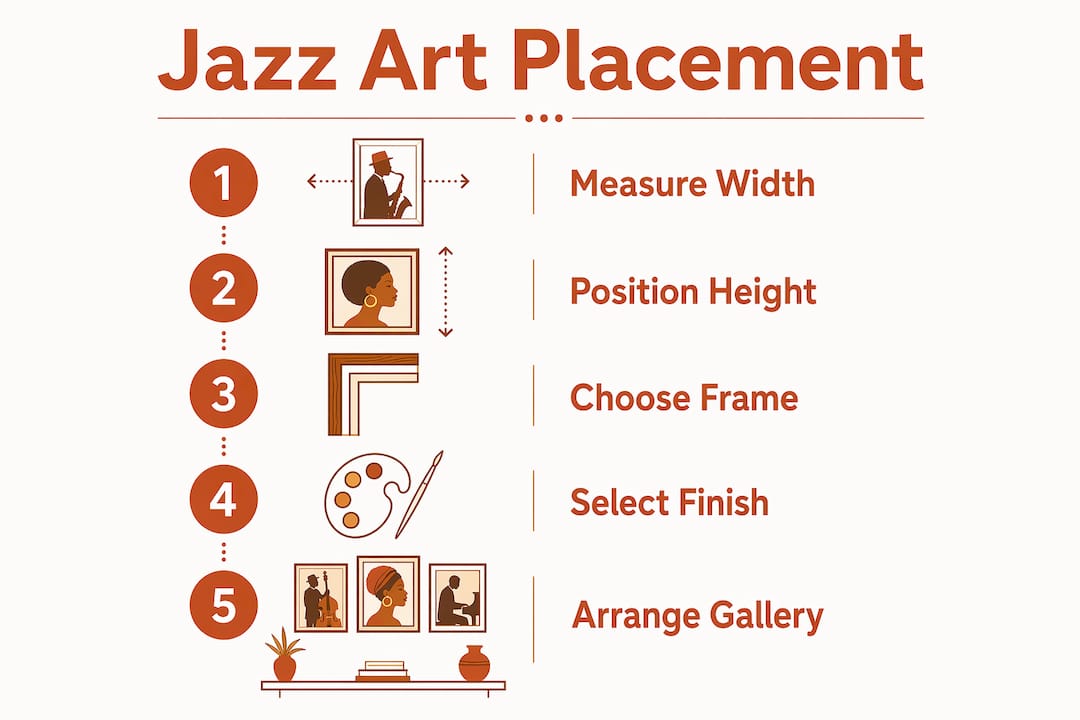
Size is the single most common mistake decorators make with framed jazz artwork. The standard rule: art above a sofa should span 60–75% of the furniture’s width. For an 84-inch sofa, that means a piece roughly 50–63 inches wide. Going narrower makes the art look like an afterthought.
Hanging height matters just as much as width. Position the bottom of the frame 6–8 inches above the sofa back, which typically centers the piece at eye level when seated. The goal is a visual connection between the furniture and the art, not a floating rectangle on an empty wall.
For rooms where you want more presence, designers recommend flexibility in applying these rules. Coverage above 75% reads as bold and intentional. Coverage below 60% works for restrained, minimalist styling. Neither is wrong. Both require a deliberate choice.
Pro Tip: Tape newspaper to the wall in the exact dimensions of your intended piece before buying. Live with it for a day. You will immediately see whether the scale feels right for the room.
| Furniture Type | Recommended Art Width | Hanging Height |
|---|---|---|
| 84-inch sofa | 50–63 inches | 6–8 inches above back |
| Queen bed (60 inches) | 36–48 inches | 2–4 inches above headboard |
| Dining table (72 inches) | 43–54 inches | Center at 57–60 inches from floor |
| Console table (48 inches) | 29–36 inches | 6–8 inches above surface |
Single large statement pieces work well in rooms with one dominant focal point, like a living room with a fireplace wall. Gallery walls with multiple jazz art prints suit hallways, dining rooms, and music studios where you want layered storytelling rather than one commanding image.
Which materials and printing techniques produce lasting jazz art prints?
Archival quality is a system, not a single feature. Pigment inks on acid-free, lignin-free paper produce prints rated to last 100–200 years under proper conditions. That lifespan drops sharply if any one element in the system fails. Dye-based inks fade faster. Acidic mats cause yellowing. A single weak link undermines the whole piece.
The most common print formats you will encounter in jazz art prints include:
- Giclée prints: Museum-grade inkjet output on fine art paper or canvas. The gold standard for color accuracy and longevity.
- Canvas wraps: Printed canvas stretched over a wooden frame. Ready to hang, no additional framing required.
- Photographic prints: High-resolution photo paper output. Vivid but typically less archival than giclée.
- Layered wooden art: Some jazz pieces use 4mm raised wooden elements with matte black finishes to create subtle three-dimensional texture. Typography-based jazz pieces use this format effectively.
Framing decisions affect both appearance and longevity. Ready-to-hang pieces include mounting hardware and are the easiest option. Unframed prints require a mat, UV-protective glazing, and a frame. Skipping the UV glazing on an unframed print is the fastest way to fade a piece you paid good money for.
Pro Tip: Always ask whether a print uses pigment or dye inks before purchasing. Sellers who cannot answer that question are usually selling dye-based prints. Pigment inks are worth the price difference for anything you plan to keep long-term.
For finish selection, matte or non-glare surfaces preserve the mood of high-contrast jazz motifs far better than glossy finishes. A glossy surface on a dark jazz club scene will catch every overhead light in the room and kill the atmosphere the image was designed to create.
How do you style a jazz-themed gallery wall arrangement?
Every strong jazz art display starts with one anchor piece. Choose something with clear jazz iconography: a saxophone silhouette, a vintage club poster, abstract typography, or a portrait of a recognizable figure from the Harlem Renaissance. Everything else in the arrangement responds to that anchor.
For gallery walls, consistent frame finish, repeating elements, and uniform 2–3 inch gaps produce the most cohesive results. Repeating a color or mat element two to three times prevents the wall from looking like a random collection. Matte black frames unify jazz motifs particularly well because they echo the high-contrast aesthetic of jazz photography and vintage poster design.
You can also explore gallery wall arrangements that mix sizes deliberately. A large anchor print flanked by two smaller pieces creates a triptych effect without requiring identical frames. The key is that the spacing stays consistent even when the sizes vary.
The two dominant approaches to jazz art styling break down like this:
- Maximalist salon wall: Five or more pieces, mixed sizes, unified by frame finish and color palette. Works well in music rooms, dining rooms, and loft spaces.
- Minimalist single piece: One large-format abstract jazz art print on an otherwise bare wall. Works in modern interiors where the art is meant to carry the entire visual weight of the room.
Pro Tip: Lay your gallery wall arrangement on the floor before hanging anything. Photograph it from above. That photo will tell you immediately whether the composition is balanced or needs adjustment.
Abstract jazz art and vintage jazz posters can coexist in the same gallery wall if the frame finish ties them together. A warm wood frame on a vintage Billie Holiday poster and a matching wood frame on a modern abstract piece creates continuity across very different visual styles.
How do frame finishes and formats match different interior styles?
Frame finish is part of the artwork’s visual composition, not an afterthought. Warm gold, satin, and natural wood finishes complement jazz art’s musical warmth and rhythm. Silver or chrome frames shift the mood toward something cooler and more industrial, which rarely serves the intimate atmosphere jazz art is meant to create.
The format you choose should match how you intend to use the space:
- Canvas wraps suit casual living rooms and music studios. They read as relaxed and contemporary.
- Framed giclée prints suit formal living rooms, dining rooms, and office spaces. They signal deliberate curation.
- Layered wooden typography pieces work well in entryways and music rooms where texture and dimension add interest at close range.
- Vintage jazz posters in simple frames suit eclectic and bohemian interiors without requiring a large budget.
Before purchasing any piece, check whether framing and hanging hardware are included. Small prints especially require proper matting and UV glazing for a professional result. A print that arrives without hardware and without a mat recommendation will cost you more time and money than the listing price suggested.
Lighting placement also affects finish choice. Directional spotlights work well with matte finishes. Ambient overhead lighting works with both matte and satin. Avoid placing glossy pieces directly under recessed can lights.
Key takeaways
The best jazz music wall art combines correct sizing, archival print quality, and deliberate frame selection to create a display that holds its visual and cultural impact for decades.
| Point | Details |
|---|---|
| Size above furniture | Art should span 60–75% of the furniture width below it for visual balance. |
| Archival print system | Pigment inks, acid-free paper, and UV framing work together; one weak element shortens print life. |
| Frame finish matters | Warm gold, satin, or natural wood finishes complement jazz art’s warmth better than chrome or silver. |
| Gallery wall consistency | Repeat frame finish and mat color two to three times with uniform 2–3 inch gaps for cohesion. |
| Check before buying | Confirm whether framing, matting, and hanging hardware are included before completing any purchase. |
What i have learned hanging jazz art in real spaces
The most common mistake I see is buying a piece based on how it looks in a product photo, then hanging it without checking the actual dimensions against the wall. A 16x20 print that looks commanding on screen can disappear on a 10-foot wall. Always work from the wall outward, not from the product listing inward.
The second thing I have learned is that frame finish is where most people underinvest their attention. You can have a stunning Harlem Renaissance jazz print and completely undercut it with a silver metal frame that fights the warmth of the image. The frame is not neutral. It is part of the piece.
Jazz art specifically rewards stylistic harmony because the music itself is built on it. A well-placed piece of abstract jazz art in a room with warm lighting, a wood-toned frame, and a matte finish does not just decorate a wall. It changes the feeling of the entire room. That is what good African American jazz and blues art does when it is selected and hung with intention.
— Robert
Explore jazz and harlem renaissance art at Melaninart
Melaninart carries a curated selection of jazz-inspired and Afrocentric wall art reproduced from original oil and watercolor paintings by artist Robert Lawrence. Every piece is printed to museum-grade archival standards, with customizable sizing and framing options. The Harlem Renaissance Jazz collection is the strongest starting point for anyone building a music-themed display. For a complete set designed to work together as a gallery wall, the Harlem Renaissance Quartet prints offer four cohesive pieces with consistent visual language. Melaninart ships ready-to-hang with hardware included.
FAQ
What is the standard size for jazz art above a sofa?
Art above a sofa should span 60–75% of the sofa’s width, with the bottom frame positioned 6–8 inches above the sofa back. For an 84-inch sofa, that means a piece roughly 50–63 inches wide.
What makes a jazz print truly archival?
Archival quality requires pigment inks, acid-free and lignin-free paper, and UV-protective framing working together. A single mismatched element, such as an acidic mat or dye-based ink, accelerates fading regardless of the other materials used.
Should i choose matte or glossy finish for jazz wall art?
Matte or non-glare finishes are the better choice for jazz-themed pieces. Glossy surfaces create distracting reflections that reduce the readability of high-contrast motifs and undercut the intimate mood jazz art is designed to produce.
How do i build a cohesive jazz gallery wall?
Start with one anchor piece, then repeat the same frame finish and mat color across two to three additional pieces. Keep gaps between frames consistent at 2–3 inches. Consistency in finish and spacing is what separates a curated display from a random collection.
What frame finish works best with jazz art prints?
Warm gold, satin, and natural wood finishes complement jazz art’s tonal warmth. Silver and chrome frames shift the mood toward something cooler, which typically conflicts with the intimate, expressive character of jazz-themed imagery.