
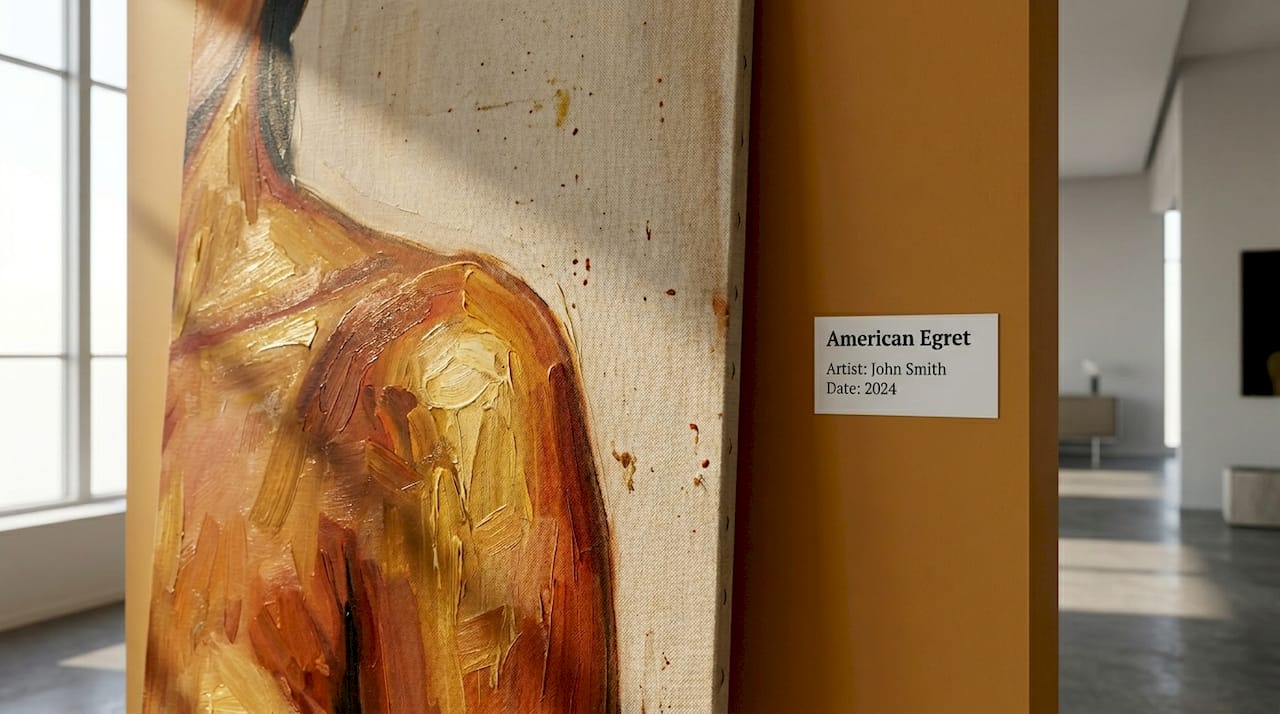
A black love painting is defined as a genre of African American love art that intentionally uses warm, saturated color palettes to communicate emotional intimacy, cultural pride, and a sense of sacred sanctuary. These works flood their canvases with terracotta, deep gold, mahogany, and velvety jewel tones. The color choices are not decorative accidents. They are calculated psychological tools, designed to make viewers feel physical warmth, emotional safety, and the weight of a love that has survived and thrived against real historical pressure.
What makes a black love painting emotionally powerful?
The defining characteristic of this genre is its warm chromatic vocabulary: rich imagery built from terracotta, amber, mahogany, natural textures, and cultural symbols that center Black identity and heritage. Where other romantic art traditions reach for pale pastels or cool blues, Black love paintings lean hard into heat. That contrast is the point. The palette signals that this love exists in a warm, protected world of its own making.
Artists working in this tradition treat color as a form of language. A deep gold highlight on a woman’s shoulder says something different than a cool white would. Mahogany shadows in a couple’s embrace carry a different emotional charge than gray. Black love art transcends romance, portraying love as survival, healing, and resistance. The palette is the first sentence of that argument.
How warm colors in Black love paintings create emotional warmth and intimacy
Color psychology offers a precise framework for understanding why these palettes work so effectively on viewers. Warm colors stimulate, cool colors calm, and vivid reds and yellows can function as genuinely activating forces on the nervous system. Roberto Assagioli’s research categorizes colors by their psychological function: sedative, recuperative, or stimulating. Terracotta, amber, and deep gold all fall into the stimulating register. They do not simply suggest warmth. They produce a felt sense of it.
This is why standing in front of a well-executed Black couple artwork in amber and mahogany tones can feel like stepping into a warm room. The eye reads the color temperature and the body responds. Artists who understand this use warm hues to build what functions as an emotional container on the canvas. The couple depicted inside that container appears protected, held, and at home.
Several specific colors carry consistent psychological effects in this context:
- Terracotta and burnt sienna signal earthiness, groundedness, and physical presence
- Deep gold and amber communicate abundance, sacred value, and radiant energy
- Mahogany and warm brown evoke skin tones, familiarity, and ancestral connection
- Jewel tones like deep plum and forest green add richness and a sense of ceremony
Pro Tip: When you view a Black love painting, pause and notice your physical response before analyzing the composition. The warmth you feel in your chest or the sense of calm in your shoulders is the color palette doing exactly what the artist intended.
What do color choices symbolize in Black love art?
Color in Black love art carries cultural weight that extends far beyond standard Western color theory. Dr. Maulana Karenga states that Black love is a practice tied to building family and society. The warm palettes in this genre reflect that philosophy directly. Deep gold references West African traditions where gold signified divine connection and communal wealth. Mahogany grounds figures in their own skin, making Blackness itself the visual center of the composition rather than a subject to be explained or justified.
The late painter Mary Lovelace O’Neal took a different but related approach. Her lampblack pigment paintings used soot-derived black as a cultural statement of identity and history, asserting Black presence in spaces that had historically excluded it. Her work demonstrates that in African American love art, every pigment choice carries political and emotional intention. Color is never neutral.
The symbolic meanings most commonly embedded in Black love paintings include:
- Gold tones: divine worth, ancestral wealth, and sacred union
- Warm browns and mahogany: skin as beauty, rootedness, and generational continuity
- Amber and ochre: harvest, abundance, and the warmth of community
- Deep jewel tones: ceremony, dignity, and the gravity of committed love
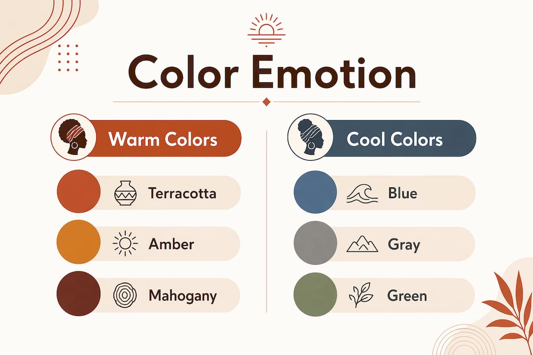
Warm versus cool palettes: what the emotional difference actually feels like
Cool colors produce calming effects, but calming is not the same as connecting. Blue tones lower heart rate and create psychological distance, which works well in clinical or contemplative spaces. In romantic black art, that distance would undercut the entire emotional argument. The genre’s near-total rejection of cool, muted hues is a deliberate artistic stance.
Mark Rothko’s work offers a useful reference point. His large-scale color fields in black and red produce intense emotional reactions, including tears, through scale, color contrast, and the sheer physical presence of saturated pigment. Black love paintings operate on a similar principle. The warm palette scaled to canvas size creates an immersive emotional field rather than a picture to observe from a distance.
| Color palette | Psychological effect | Emotional register |
|---|---|---|
| Terracotta and amber | Stimulating, physically warm | Intimacy, safety, presence |
| Deep gold and ochre | Activating, ceremonial | Pride, abundance, sacred connection |
| Cool blue and gray | Calming, distancing | Contemplation, detachment |
| Muted pastels | Soft, low stimulation | Nostalgia, fragility |
| Jewel tones with warm base | Rich, immersive | Dignity, depth, emotional gravity |
Pro Tip: Match the palette of a Black love painting to the emotional function of the room. Amber and terracotta works suit living rooms and bedrooms where warmth and connection are the goal. A Frontiers psychology study confirms that moderate saturation and warm tones interact differently depending on spatial context, so scale and placement matter as much as color choice.
How to select and experience Black love paintings for maximum impact
Choosing a piece of romantic black art for your home is most effective when you treat the viewing process as active rather than passive. Research from Salford Museum and Art Gallery found that 81% of visitors reported improved mood after slow-looking and color-themed art experiences. Slow looking means spending at least five uninterrupted minutes with a single work, observing how color shifts across the canvas and how your emotional state changes in response.
When selecting prints for your space, prioritize works where the warm palette is applied with tonal variation rather than flat color. Amber that shifts from pale gold to deep burnt orange across a figure creates a sense of three-dimensional warmth. Mahogany shadows that hold texture and depth read as skin rather than paint. These qualities are what separate gallery-caliber Black love art prints from generic decorative work.
Use these reflective prompts when viewing a piece before purchasing:
- Where does your eye land first, and what color is it?
- Does the palette make the space feel warmer or cooler?
- Do the figures feel present and grounded, or distant and idealized?
- What emotion surfaces in the first thirty seconds of looking?
Key takeaways
Black love paintings use warm, saturated palettes of terracotta, amber, mahogany, and deep gold to produce measurable psychological warmth, cultural affirmation, and emotional intimacy in viewers.
| Point | Details |
|---|---|
| Color is intentional language | Warm hues like amber and mahogany are chosen to stimulate emotional warmth, not for decoration alone. |
| Cultural symbolism runs deep | Gold, mahogany, and jewel tones reference African and diasporic traditions of sacred worth and communal identity. |
| Cool palettes create distance | Black love art rejects cool, muted tones because they produce psychological detachment rather than connection. |
| Scale amplifies emotional impact | Large-format warm-palette works create an immersive emotional field, not just a visual one. |
| Slow looking deepens the experience | Spending five or more minutes with a single work, as Salford Museum research confirms, measurably improves mood and emotional engagement. |
Why warm palettes in Black love art changed how I paint
I have spent years working with oil and watercolor, and the single most clarifying realization I have had is that color temperature is not a stylistic preference. It is a structural decision. When I paint a Black couple, the first question I ask is not about composition or scale. It is: what is the emotional temperature of this love? The answer determines every pigment choice that follows.
I have seen viewers stand in front of works built in amber and velvet tones and physically relax. Their shoulders drop. Their breathing slows. That is not a coincidence. It is the palette doing its job. Cool tones would produce a different body response entirely, and that response would contradict everything the subject matter is trying to say about love as sanctuary.
What I find most underappreciated in discussions of African American love art is how much the warm palette functions as an act of cultural reclamation. To paint Black love in gold and terracotta is to insist that this love is warm, abundant, and worth centering. That insistence is built into the pigment itself.
— Robert
Explore Black love paintings with warm, emotionally resonant palettes
Melaninart’s curated Black Love Art collection brings together original oil and watercolor paintings reproduced as museum-grade archival prints, each built around the warm chromatic palettes this article explores. Works like the Held Close canvas exemplify the amber and velvet tones that create emotional sanctuary in any room. Every print ships with customizable framing and sizing options, so you can match the scale to your space and maximize the psychological impact. For a broader view of culturally significant work, the Afrocentric art collection offers additional pieces that center Black identity, heritage, and love with the same chromatic intentionality. If you are looking for a creative gift for someone who values meaningful art, these prints carry both aesthetic and cultural weight.
FAQ
What is a black love painting?
A black love painting is a genre of African American art that depicts Black romantic and familial relationships using warm, culturally rich color palettes and symbolic imagery. The works communicate love as survival, healing, and cultural pride, not only romance.
Why do Black love paintings use warm colors like amber and terracotta?
Warm colors like amber and terracotta are psychologically stimulating and produce a felt sense of physical warmth and emotional safety in viewers. Artists choose these hues deliberately to make Black love feel grounded, abundant, and sacred rather than distant or idealized.
How does color psychology apply to Black couple artwork?
Color psychology, as outlined in Roberto Assagioli’s research, classifies warm colors as stimulating and cool colors as calming or distancing. Black couple artwork uses warm palettes to activate emotional connection and intimacy rather than the detachment that cooler tones would produce.
How do I choose a Black love painting for my home?
Match the palette’s emotional temperature to the room’s function. Amber and mahogany works suit bedrooms and living rooms where warmth and connection are priorities. A Frontiers psychology study confirms that warm saturation interacts differently depending on spatial scale, so consider the wall size before selecting a print.
Can viewing Black love art improve my mood?
Research from Salford Museum and Art Gallery found that 81% of visitors reported improved mood after slow-looking and color-themed art experiences. Spending five or more uninterrupted minutes with a warm-palette Black love painting produces measurable emotional and psychological benefits.